forbes.com
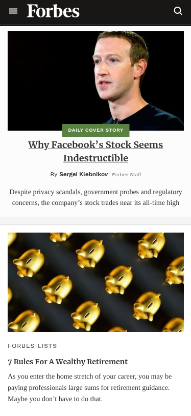
We can easily see the alignment on this page by looking at the hamburger menu, the images (the first one changes all the time on this website by the way), and the paragraphs. If we look at the glass on the top-right of the screenshot, we will see it's aligned with the image as well. PS: This is also the maximum limit the paragraph can go.
Contrast
IBM
ibm.com
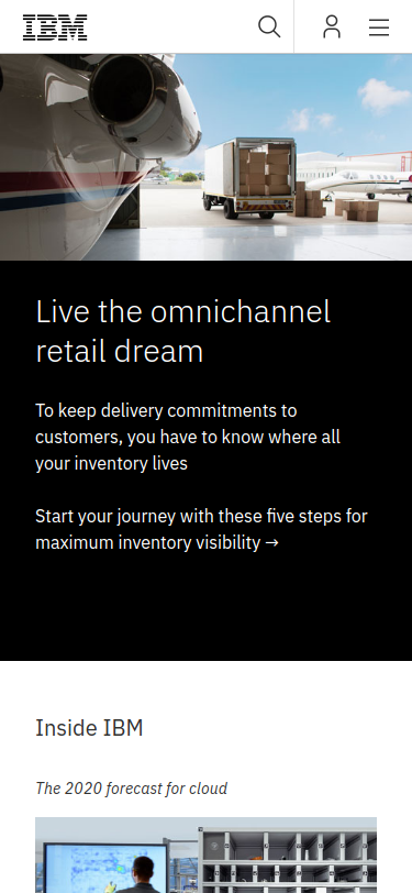
I believe that contrast is one of the easiest principles to find out, such fact makes it hard to choose though because of the many choices. In this screeshot, we can tell the background color changes straight up from black to white, and also there's a good contrast between the image on the top and the black background right below it.
Repetition
American Airlines
aa.com
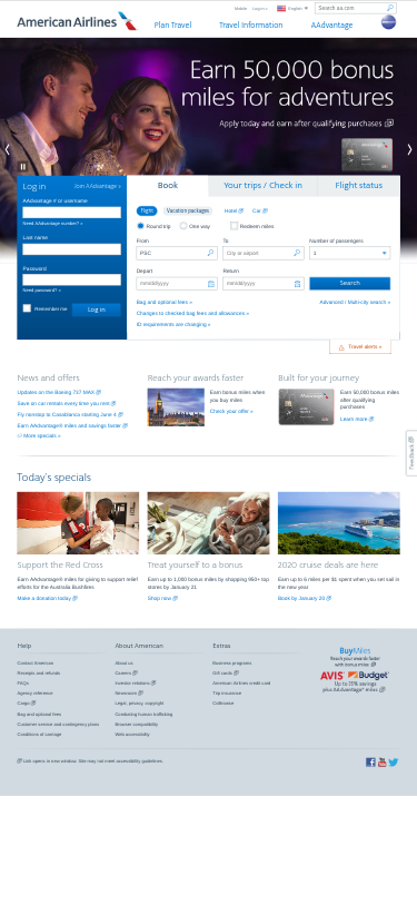
I'll have to be honest with you, the sectionason why I chose this picture was because of the repetition of the company's logo. You probably can see an AA logo on the top of the screenshot, but can you see the same logo on the top-right of a card on the banner? We can see this same card in the middle of the page, and it has the same logo. But let's suppose that it's hard to find out and we need something better; we can still go for the blue color that is being used so many times on the fonts (nav bar on the top, a paragraphs in the middle and some links also in the middle of the page). Do you believe me now?